3 modern ways to make your website stand out

The internet is more crowded than ever, and getting noticed isn't easy. With so many websites competing for attention, a polished design alone isn't enough. If you want your site to stand out and actually stick in people's minds, you need to go beyond the basics—think strategy, personality, and meaningful visual impact.
Here are three fresh, effective ways to make sure your website stands out in 2025.
Why does your website need to stand out?
A standout website isn't just about aesthetics; it's about clear communication, brand recognition, and memorable experiences. A strong digital presence builds credibility, captures attention, and ultimately turns casual visitors into loyal fans or customers.
To make your website more distinctive:
- Use color and design with purpose
- Add visual storytelling that connects with visitors
- Highlight what makes you different
- Offer a seamless, enjoyable user experience

Tip 1: Build a bold, consistent brand identity
Your website should reflect your brand's unique voice and value. This means creating a cohesive identity across visuals, tone, and messaging. When someone lands on your site, they should instantly recognize who you are and what you stand for.
Ask yourself:
- What makes your product or service different or better?
- How do you want your audience to feel when they visit your site?
- Is your visual identity consistent: colors, fonts, logo, tone?

Whether you are quirky, elegant, minimal, or bold, lean into your uniqueness. Authenticity builds trust and makes you more memorable.
Tip 2: Use color psychology to guide engagement
Color isn't just decoration, it's strategy. The right color palette can subtly influence how visitors interact with your site. In 2025, we are seeing a rise in vibrant, high-contrast designs that mix boldness with clarity.
Some quick insights:
- Blue = trustworthy, calming (great for services and tech)
- Yellow/Orange = energetic, creative (good for calls to action)
- Green = fresh, balanced (great for eco or wellness brands)
- Gradients = modern, dynamic (adds depth and interest)
Avoid generic themes. Instead, craft a color system that reflects your brand and enhances user experience. Even a small adjustment can increase engagement and time-on-page.
Tip 3: Tell a visual story with intentional imagery
Today's audiences skim. If your site lacks compelling visuals, they will bounce. Use images not just to decorate, but to tell your story.
Use photography, illustrations, or graphics that:
- Capture emotion
- Reflect your brand personality
- Help explain your message or product
Think of images as conversation starters. A well-placed, thoughtful visual often says more than a paragraph of text. Use them to spark curiosity and keep people scrolling.
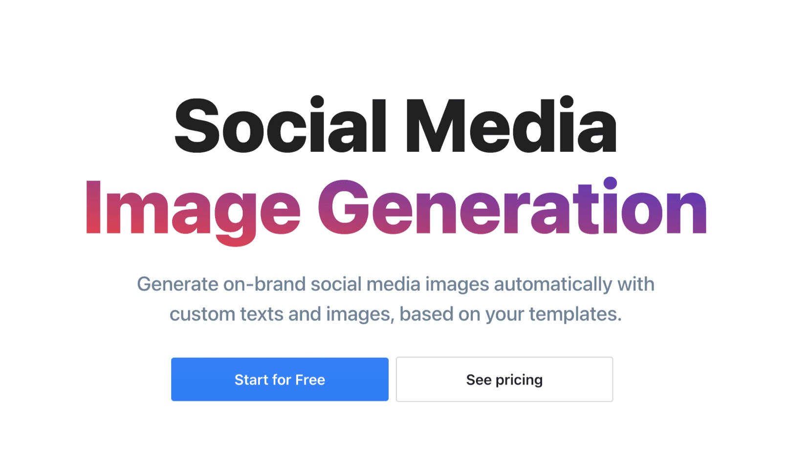
👩🎨 Bonus: Create custom images in minutes
Want to make your website truly yours? Skip the generic stock photos. Create personalized images that match your brand with tools like RenderForm.io.
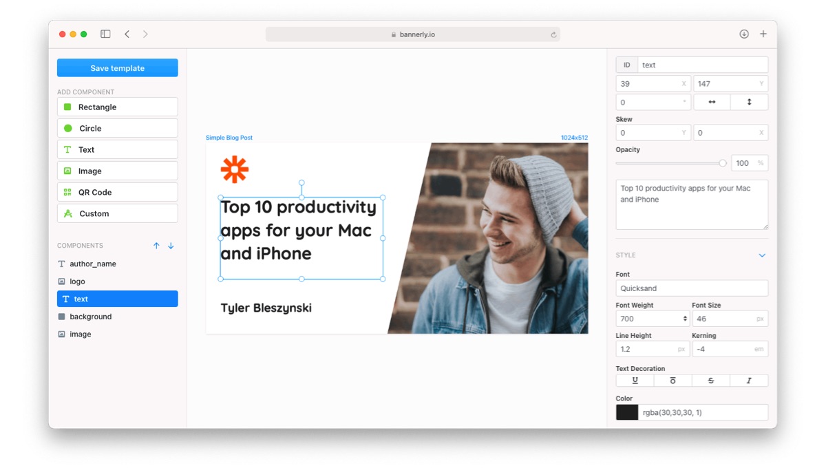
Try the RenderForm template editor to create sleek, customizable graphics, ideal for blog headers, social posts, and product pages.
Custom imagery doesn't just look better—it shows your visitors you care about quality.
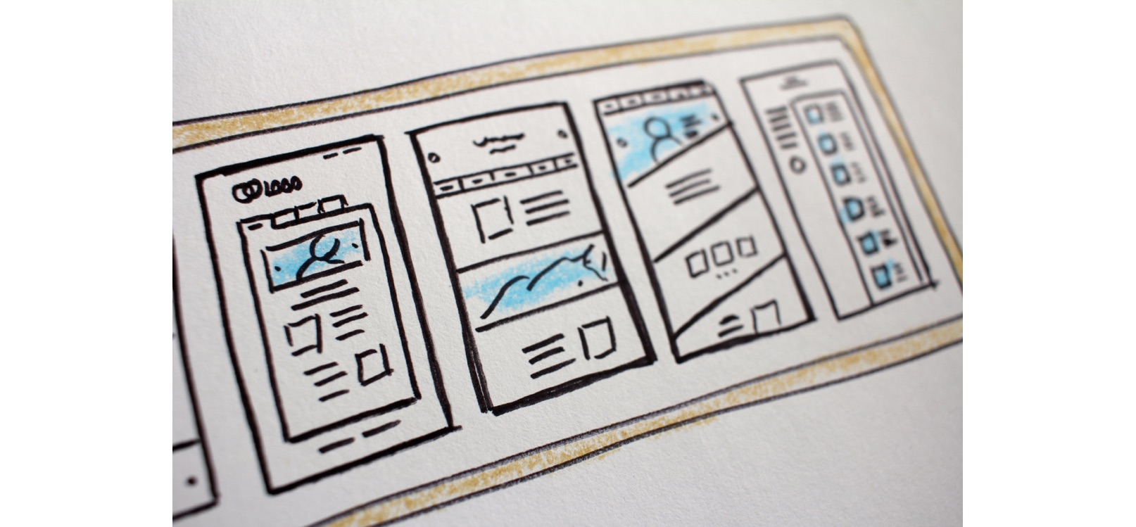
Automate image creation
With RenderForm, updating images on your site is a breeze. Create a template once, and then generate new images in seconds. No more hunting for the perfect stock photo or spending hours in design software.
Build your brand's visual library with ease, keeping your blog and social media images fresh and aligned with your brand identity.
Learn more about generating multiple images with different texts from a template
Final thoughts
Making your website stand out isn't about reinventing the wheel, it's about being intentional. Define your brand, choose color and visuals with purpose, and put your uniqueness front and center.
💡 Need help getting started? Start small. Update your homepage with a more vibrant hero image or refresh your color palette, and keep building from there.


